As web developers for law firms, we’ve picked up a thing or two about the best site development practices. In Part 1 of this series, we covered some of the core technical aspects of designing a website that is optimized for SEO. In this article, we’ll share tips for usability and esthetics when designing (or choosing a design) for your law firm’s website, including (1) simplifying navigation, (2) displaying good content, (3) choosing the best design colors, and (4) using proper typography.
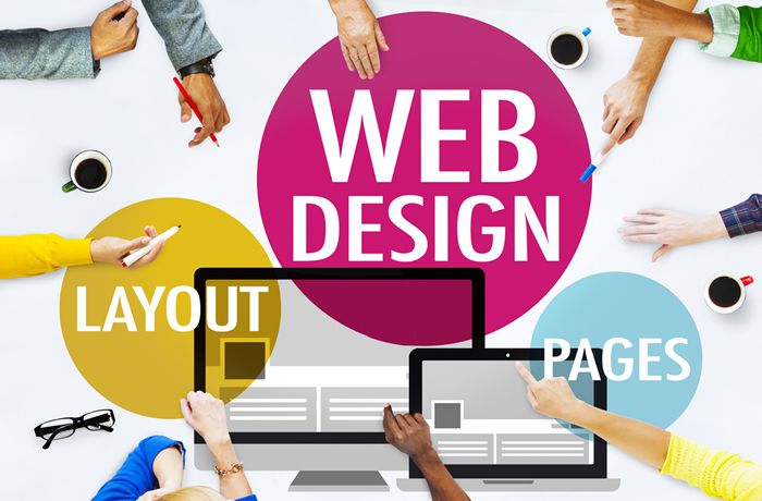
Usability & Esthetics – Critical Ingredients
With so many potential clients choosing lawyers by researching online, you can’t overlook the appearance of your website. Having said that, I know many great lawyers whose websites are, in a word – awful! Although these lawyers exemplify the meaning of the word “professional,” their websites look like they were designed in the 1990s by a high schooler.
Your firm’s website shouldn’t be a marketing afterthought. It is your digital calling card and, often, the very first impression that a potential client has of your firm. Therefore, you need to ensure that you’re giving your visitors the best impression and friendly user experience if you want to convert site visitors into clients.
Navigation – Make it Simple
Your website’s navigation is CRITICAL, and it greatly impacts your site’s success or failure. Your main navigation can mean the difference between a lead or a quick exit from your site. The main goal in your navigation should be user-friendliness.
In preparation for writing this article, I visited a personal injury attorney’s website, and I took the time to count how many clickable areas there were on the site. This particular site assaults its visitors with 112 NAVIGATION CHOICES on the site’s home page with multiple calls to action, menus with submenus and sub-sub menus, and an overwhelming number of navigation choices. The end result is that visitors’ eyes are likely to scan past any important items because the site is overwhelming.
Limit your navigation, particularly your main menu. As for the main menus, I recommend no greater than 7 menu choices. Ultimately, with fewer menu and navigational items, your visitors’ eyes are less likely to scan past important items. Also, place your navigational menus in areas visitors expect them to find, such as horizontal navigation across the top or vertical navigation down the left. Ultimately, better, simpler navigation means a lower bounce rate, more pages per visit, and higher conversions.
Content – Concise Without Legalese
In my opinion, many law firm websites have the WORST content for two reasons:
1) Too Much Content – According to studies conducted by the Nielsen Norman Group, a leading user experience consulting group, 79% of people don’t actually read content online. Instead, they can pick up words and phrases as they go. Additionally, users will only read about 20% of the text on an average page. The bottom line is that you should format your content to make it easy for visitors to scan your site for the most valuable information. Here’s how you do it:
- Use engaging headlines and subheadings – Most people will use headlines to scan your article and decide whether to read it. Make strong headlines work for you the same way they do in magazines.
- Use bulleted or numbered lists – Lists are easier for people to read and to comprehend than long blocks of text.
- Be concise – Make sure your content is both clear and brief
- Use graphics and videos – Break up content visually (and give your readers a break) with relevant graphics and videos.
2) The Content is Written by a Lawyer – The surest way to ensure NO ONE reads your website’s content is to use highbrow statements or legalese. Don’t talk down to your audience; don’t try to make your firm sound important by using lofty expressions. Your website’s content should be simple and familiar. Technical words should be the exception, not the rule.
Color – Communicate with Your Palette
Color is important in your website design for a law firm’s success. When used properly, color is a powerful form of communication that can sway thinking, change actions, and cause reactions. Before you choose a color scheme for your website, consider the following overview of the “meaning” expressed by various colors:
| Color | Positive Meaning | Negative Meaning |
|---|---|---|
| Red | Energetic, masculine, and exciting. | Defiant, aggressive, and urgent. |
| Blue | Secure, intelligent, and logical. | Cold, aloof, and unfriendly. |
| Green | Balanced, peaceful, and wealthy. | Boring, stagnate, and bland. |
| Yellow | Youthful, optimistic, and creative. | Irrational, fearful, and anxious. |
| Orange | Aggressive, passionate, and fun. | Frustrating, frivolous, and immature. |
| Pink | Warm, feminine, and sexual. | Inhibiting, emasculating, and weak. |
| Brown | Earthy, reliable, and supportive. | Humorless, heavy, unsophisticated. |
| Black | Sophisticated, efficient, and glamorous. | Oppressive, cold, and menacing. |
| Purple | Spiritual, luxurious, and quality. | Decadent, suppressive, and inferior. |
| White | Pure, sophisticated, and efficient. | Sterile, unfriendly, and elite. |
| Grey | Neutral, elegant, and formal. | Boring, drab, and depressing. |
Typography – Emphasize Readability
Typography isn’t just about choosing fonts or making things look pretty. Instead, typography is the art of displaying content. Typography guides your readers through your website, makes your content attractive, and gives your site a consistent look. In other words, selecting typefaces and their arrangement can be as important as using words, colors, and graphics. At the very least, I recommend the following:
1) Don’t overuse fonts – Keep your typeface consistent. The more you mash up different typefaces in your content, the less readable and cohesive your site becomes.
2) Keep Heading Size, Font, and Attributes Consistent – For example, if your headline on one post or page is Helvetica typeface, 18 points in size, blue, and bold, then keep it that way on every post and page where you use headings.
Final Thoughts
Good design is crucial to your website’s usability, readability, and overall “atmosphere.” To ensure your website’s success, keep your navigation and content simple, choose colors that convey the right “psychological” message to your readers, and don’t overlook the importance of proper typography to guide your readers in an attractive and consistent way through your site.
